
Typography Trends 2025: The Fonts and Styles Shaping Modern Design
Typography is the backbone of graphic design. More than any other element, the fonts you choose and how you set them communicate personality, authority, mood, and brand identity. In 2025, typography is experiencing a genuine renaissance — driven by new font technology, social media’s influence on visual culture, and a rebellion against the safe, generic type choices that dominated the corporate design world for years.
Whether you design brand identities, social media content, websites, or editorial layouts, understanding the typography trends shaping 2025 will give you a significant creative and commercial advantage.
Variable Fonts: The Most Flexible Type Technology Yet
Variable fonts are single font files that contain multiple variations of weight, width, slant, and other typographic axes along a continuous spectrum. Instead of having separate files for light, regular, medium, bold, and black weights, a variable font lets you dial in exactly the weight you need — 327 instead of 300 (light) or 400 (regular). This is revolutionary for web design in particular, where file size and loading speed matter enormously.
In 2025, major type foundries have embraced variable fonts as their primary format, and designers are using the technology to create animated type that shifts weight and width in motion graphics. Fonts like Inter, Recursive, and Fraunces are excellent starting points for variable font experimentation.
The Return of the Serif
For much of the 2010s, sans-serif fonts dominated digital design — clean, neutral, and screen-friendly. But in 2025, editorial and display serifs are making a powerful comeback. Brands that previously used safe sans-serif typefaces are switching to distinctive serifs to signal sophistication, authority, and timelessness.
The serifs leading this revival are not the stodgy Times New Roman type. They are the high-contrast, modern serifs with dramatic thick-thin contrast and personality — typefaces like Canela, Editorial New, Freight Display, and the open-source Playfair Display. These fonts command attention and look exceptional on both premium packaging and website hero sections.
Experimental and Anti-Design Typography
Counterculture always makes its way into mainstream design eventually. In 2025, the influence of punk zines, underground music posters, and early internet aesthetics is visible in a growing trend toward experimental, anti-design typography. This includes deliberately distressed or layered type, stacked vertical text, text that breaks out of conventional reading order, and fonts that push the boundaries of legibility.
This style is not for every brand, but for youth-oriented brands, artists, musicians, and creative agencies, experimental typography is a powerful signal of authenticity and edge.
Kinetic Typography: Type in Motion
As social media platforms prioritize video content, kinetic typography — animated text that moves, bounces, morphs, or reveals itself — has become an essential skill for any designer working on digital content. The range of kinetic type styles is enormous: from subtle fade-ins and word-by-word reveals to elaborate typographic animations where letters dance across the screen to music.
Accessible tools like Adobe After Effects (for professionals) and CapCut, Canva, and Jitter.video (for those new to motion) have made kinetic typography achievable without specialist motion graphics knowledge.
Custom Lettering and Hand-Drawn Type
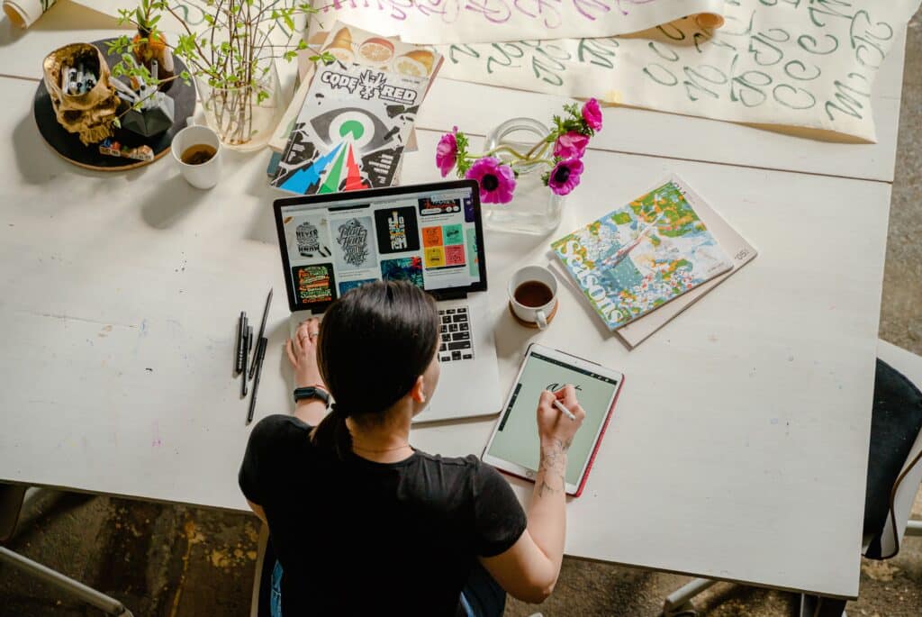
In a world saturated with perfectly kerned digital type, hand-drawn lettering and custom lettering stands out because it is human. It communicates craft, personality, and uniqueness in a way that purchased fonts simply cannot. The most effective use of custom lettering in 2025 is in brand logos, product packaging, social media highlight covers, and wedding or event stationery.
Best Free and Premium Fonts for 2025
For display headings: Playfair Display (free on Google Fonts), Canela (premium), Editorial New (premium). For body text: Inter (free), Source Serif 4 (free), GT America (premium). For experimental work: Space Grotesk (free), Monument Extended (premium). Always pair a characterful display face with a clean, readable body font — contrast between display and text fonts is what makes typography sing.