Color Trends in Graphic Design for 2025: Palettes That Convert and Captivate
Color is the most immediate and emotionally powerful element in any design. Before a viewer reads a single word, before they process a shape or layout, they feel the colors. This is why color decisions in graphic design are never purely aesthetic — they are strategic, psychological, and culturally coded choices that can determine whether a design connects or falls flat.
In 2025, the color landscape in graphic design reflects a fascinating tension between two opposing forces: the desire for warmth, comfort, and naturalness in response to global uncertainty, and the pull toward bold, electric energy that signals confidence and vitality. The most successful designs this year know how to speak both languages.
The Big Color Story of 2025: Mocha Mousse and Earth Tones
Pantone’s Color of the Year for 2025 is Mocha Mousse — a warm, rich brown with cocoa undertones that evokes indulgence, earthiness, and quiet luxury. This selection has rippled through fashion, interior design, and graphic design, fueling a broader trend toward chocolate browns, terracotta reds, dusty pinks, warm creams, and muted olive greens.
This earthy palette is performing exceptionally well in food and beverage branding, wellness and self-care products, sustainable and eco-conscious brands, and luxury lifestyle brands. It communicates naturalness, authenticity, and sensory pleasure — qualities that resonate deeply with current consumer values.
Electric Accents and Neon Pops
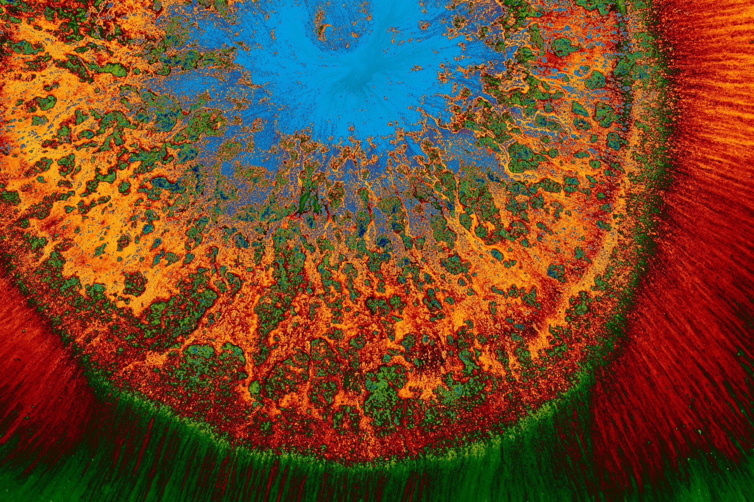
Running in parallel with the earthy neutrals trend is the continued power of electric, neon accent colors. Electric blue, hot magenta, acid green, and vivid coral are being used as deliberate counterpoints to muted base palettes — a single neon accent in an otherwise earth-tone design creates extraordinary visual tension and draws the eye precisely where the designer intends.
This combination technique — earthy base with electric accent — is one of the most versatile and effective color strategies of 2025. It works in social media graphics, brand identities, packaging, and web design.
The Color Psychology Behind Top Brand Palettes
Color psychology is not about rigid rules (blue always means trust, red always means danger) but about cultural context and strategic contrast. In 2025, some of the most strategic color uses include deep navy paired with warm gold for premium B2B brands, sage green with off-white for wellness and slow-living brands, bold black with a single vivid accent for fashion-forward brands, and warm terracotta with cream for artisanal food brands.
How to Build a Brand Color Palette from Scratch
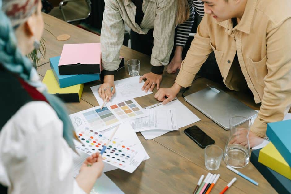
Step one is to define your brand’s personality in three adjectives. Step two is to research competitor color palettes in your industry — you want to stand out, not blend in. Step three is to choose a primary color that expresses your key brand attribute. Step four is to select one or two secondary colors that complement or contrast effectively. Step five is to add a neutral (near-white or near-black) for backgrounds and body text. Step six is to test your palette across all intended applications — digital screens, print, and packaging respond to color differently.
Tools for Exploring and Building Color Palettes
Coolors.co is the fastest tool for generating and browsing color palettes. Adobe Color allows you to build palettes from images, color wheel rules, or trending palettes from the design community. Muzli Colors provides inspiration from real design projects. And if you want to ensure your color choices are accessible to colorblind viewers, the Coblis Color Blindness Simulator is essential.