Packaging Design Inspiration: How Great Packaging Sells Before You Buy
Packaging design is one of the most commercially consequential forms of graphic design that exists. Research consistently shows that consumers make purchase decisions at shelf within three to seven seconds — meaning that your packaging has less time than a single deep breath to communicate your brand’s entire value proposition, personality, and competitive advantage. In that three-to-seven-second window, the right packaging design can be worth millions of dollars in annual revenue.
Great packaging is not just about looking beautiful. It is about communicating the right things to the right people at exactly the right moment. Understanding what makes packaging work — and studying the best examples in the world — is essential for any designer working in product, consumer goods, or retail branding.
The Hierarchy of Information in Packaging
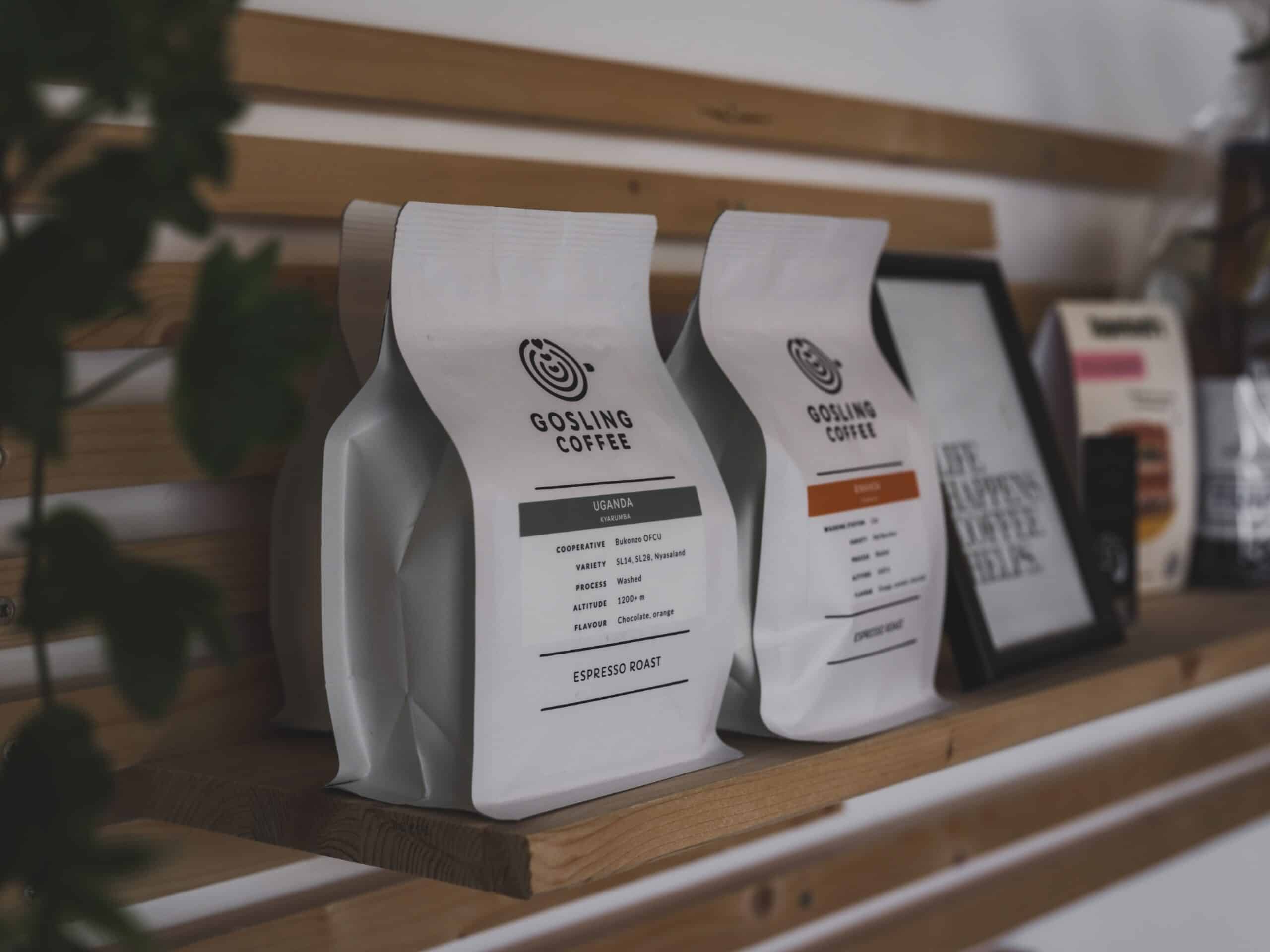
Every great packaging design answers the viewer’s questions in order: what is this? Who is it for? Why should I care? What do I do next? These questions correspond to visual hierarchy levels — brand name and logo at the highest hierarchy, product name and category at the second level, key benefits or differentiators at the third level, and purchase information (size, quantity, instructions) at the fourth.
When packaging fails, it is usually because this hierarchy is scrambled — the designer put an attractive background pattern at the first level of attention and buried the product name in a corner. Beautiful graphics cannot compensate for unclear communication.
Color as Sales Tool in Packaging
Color in packaging has a documented commercial impact. Studies show that color increases brand recognition by up to 80 percent. More specifically, dominant color on packaging communicates product category (blue and white for dairy, green for health and organic, red and yellow for food and appetite stimulation) so effectively that breaking category conventions requires careful consideration of whether the disruption creates positive differentiation or just confusion.
Case Study: Aesop — Premium Through Restraint
Australian luxury skincare brand Aesop has built one of the most recognizable packaging identities in the world using extraordinarily simple means: brown glass bottles, amber plastic, and a single no-frills label in a clean sans-serif typeface. No photography, no illustration, no elaborate color system. The restraint itself communicates premium quality and ingredient integrity so effectively that Aesop products are instantly recognizable on any shelf.
The Rise of Sustainable Packaging Design
Environmental responsibility has moved from a niche concern to a mainstream consumer expectation, and packaging design has responded accordingly. Recycled paper textures, unbleached kraft board, minimal printing, soy-based inks, and packaging designed to be repurposed or composted are all design choices that communicate values alignment with environmentally conscious consumers. In 2025, sustainability in packaging is not a trend — it is a baseline expectation.